“Draw the motto ‘Rich in Christ’!” This is a challenge that graphic designers across the world have taken up. nac.today shows some of the first illustrations and drawings.
At the request of the District Churches, brothers and sisters in many countries have drawn, designed, and painted our 2019 motto. What emerged is a variety of logos and graphic designs. The designers were given enough freedom to express cultural diversity, creativity, and uniqueness. It was not a competition nor was there a ranking—it was about beauty, colour, and shapes.
The gold ring from South-East Asia
“This year we used a combination of royal blue for the background and gold for the text,” Keefe Setiobudi from Jakarta in Indonesia says. The idea of a round logo with the centrally positioned letters “Rich in Christ” is to represent something rich, elegant, and of high value. Unlike last year, a very simple font (sans serif) has been used to express the clear message of the motto. The gold ring that encircles the motto represents the unity of the children of God.
The Brazilian treasure chest
The Brazilian District Church designed a colourful logo. It depicts an open treasure chest full of gold coins. Ricos em Christo it says on the chest, which is Portuguese for “Rich in Christ”. The gold coins are either stamped with a communion cup, a Bible, a heart, or a cross. “The logo will be published on our website,” Karin Zwar, the nac.today correspondent in Curitiba (Brazil) says. And it will also appear on T-shirts, “which we will have made for every brother, every sister, and every child”. This has become a tradition and paints a great picture on many occasions—inside and outside the church.
The Canadian twin
The New Apostolic Church Canada has issued not just one logo but two. As in previous years, Canada always designs an English and a French version. “It was important for us that additional words accompany the motto in order to understand the meaning or context supporting the motto. As ‘rich’ is so often associated with material wealth, it was decided to add ‘love’, ‘knowledge’, and ‘peace’ to the design,” nac.today correspondent Christy Eckhardt from Waterloo (Canada) says. The size and shape are incidentally consistent with the previous year’s design so that it is recognised as a standard feature for use in print and media.
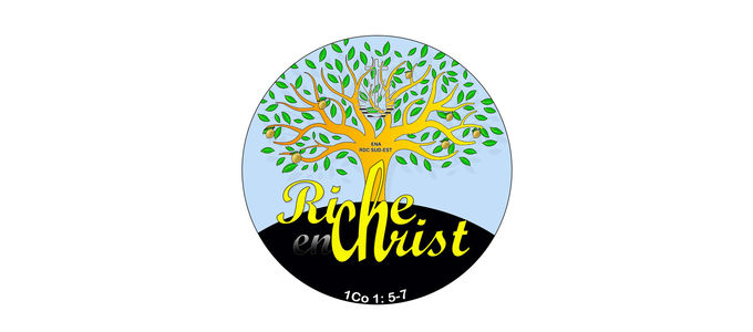
The tree from the Congo South-East
A beautiful tree with many branches, leaves, and fruit—this is the core element of the logo designed by the District Church Democratic Republic Congo South-East. Riche en Christ has been centred in the bottom third of the round logo and beneath it the Bible reference 1 Corinthians 1: 5–7, which this year’s motto is based on.
The Congolese coin
A large gold coin has been designed for the brothers and sisters in the DR Congo-West. District Apostle Michael Deppner explains: “The coin is reminiscent of the widow who did not stop looking for the lost coin, and when she had found it went to tell her friends and neighbours.” The parable illustrates the joy over one sinner who repents. The laurel wreath, the District Apostle adds, is a reference to a victor’s crown: the crown of life, of glory, and of righteousness. It is an image for our redemption—not a great king’s crown, but one made of leaves, like that of an athlete. It reminds us of our eternal goal, life everlasting.”
The diamond from Argentina
A cut blue gem is what the Argentinian logo shows. “We used the diamond as a logo. It represents the most beautiful and precious thing we can own,” Viviana Aloy, our correspondent in Argentina says.
The European interpretation
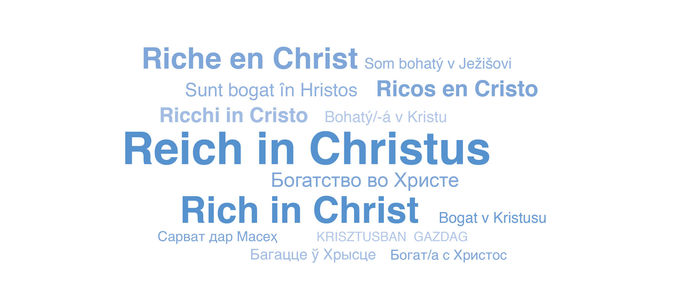
The simple combination of 14 different languages characterises the design of the New Apostolic Churches in Europe. These include Богатство во Христе (Russian), Ricchi in Cristo (Italian), Bogat v Kristusu (Slovenian), or Reich in Christus (German).
A play on words from South Africa
The different colours in the South African logo stand for the diversity in the District Church, for the rainbow of nations, a reference to the country’s multi-cultural society, Brent Thomas of the New Apostolic Church Southern Africa says. The most asked question about the logo design is, “Why is the ST in a different colour than the rest of CHRIST? The answer is simple, it’s not the ‘ST’ but the ‘CHRI’. If rearranged, it spells ‘RICH’ and shows us that ‘rich’ is literally in the word ‘Christ’,” the graphic designer says. “However, it may not be immediately evident. – This design element was thought up by our District Apostle.”
The motto itself is the same everywhere. In order for everyone to understand it, however, and take it with them into their everyday lives, different letters, words, and images are required. And this is exactly what the brothers and sisters around the world are demonstrating—through translations, graphic elements, and in some places also with posters in display cases in front of their churches. In keeping with this year’s motto, the posters state: “I am rich …”
Whether as a badge, in letters or emails, or on websites—the logos are being used in many places already. And new ones are added every day, representing our 2019 motto in an artistic and catchy way.


