Threatening waves and outstretched hands: these are the most common motifs in the logos depicting our 2026 motto. Here are the official designs of the District Apostle Areas.
A wave towers over a group of people. But they are being carried in a large hand. This is how the New Apostolic Church Southern Africa visualised the motto “Don’t be afraid. Just believe!”
The idea with the wave was inspired by the story of Jesus calming the storm. The wave symbolises the spiritual and natural challenges we face, which can lead to fear and anxiety. The hand represents God’s permanent presence in our lives, supporting us during our challenges even when the waves crash on us.
Carried through ups and downs
A very similar idea comes from a completely different corner of the globe. The logo from Canada depicts a small sailboat navigating through stormy waters. The New Apostolic Church Canada explains that the image captures the reality of our spiritual journey. “Life brings real storms, real fears, and real challenges that can leave us feeling vulnerable and unsteady.”
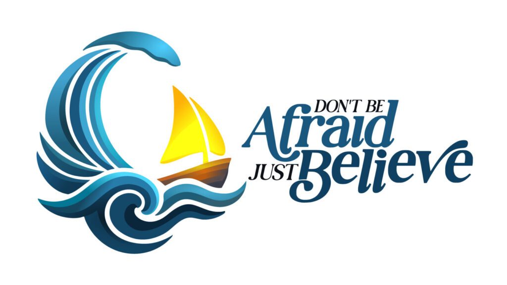

The boat is small, and the sea is vast, but Jesus Christ is with us. “He illuminates our path—leading us through the storm and preparing us for a perfect future.”
Waves, a family, and a cross underneath a dome. This is how the Democratic Republic of the Congo South-East has visualised the topic. Despite spiritual and material upheavals, believers rise above them and turn to Christ. They know they are safe in God’s care.
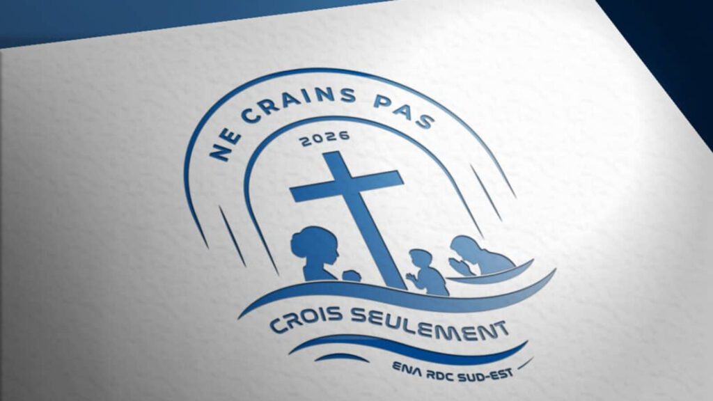
Protected under His hand
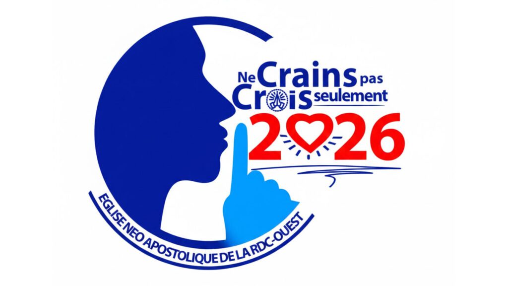
“Be quiet,” is the message from the Democratic Republic of Congo West. However, the finger pressed to the lips is not meant to silence people, but to quiet fears. A human face in profile symbolises humanity facing challenges, fear, and uncertainties. The surrounding blue circle represents God’s caring and protective presence, as well as His love and faithfulness toward the believer.
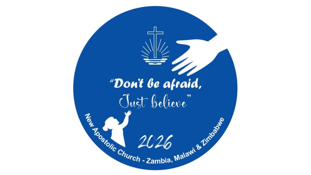
This is exactly how the surrounding circle in the logo from the New Apostolic Church Zambia, Malawi, and Zimbabwe is to be understood. A girl stretches her hand upward as a strong hand reaches down from above. This alludes to various biblical stories in which Jesus said at the end, “Your faith has made you well.”
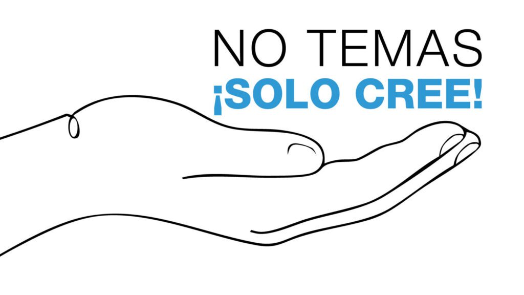
The design from South America is discreet. “Do not be afraid, just believe!” is such a powerful phrase that the image should only accompany it, not explain it. The only graphic element is an open hand. The open hand “neither pushes nor holds back: it waits, offers, supports, and provides confidence. It denotes the shelter, support, and constant presence of our Father.”
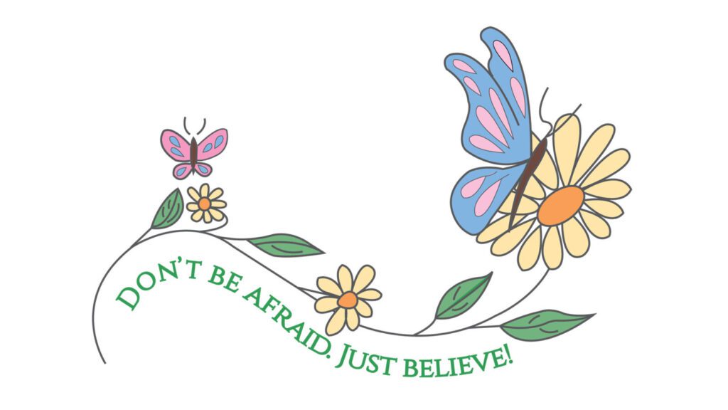
Between shield and butterfly
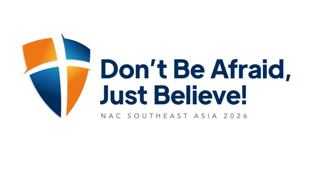
A blue-orange protective shield forming the shape of a cross is the pictorial element in the concept from South-East Asia. The shield is a reference to the shield of faith mentioned in Ephesians 6: 16. The colour blue represents calmness and trust, while orange signifies courage and hope.

The design from the Western Pacific working area depicts delicate butterflies among flowers. “The most delicate and fragile in God’s creation are often the most vulnerable,” the district explains. “Yet, within the environment He has designed for them, they live, flourish, and make a quiet but vital contribution to the harmony of life.” For “My strength is made perfect in weakness” (2 Corinthians 12: 9).

A child learning to walk and being encouraged by his father. This is how East Africa has visualised the motto. When children are learning to walk, dangers are many and are real. But the possibility of walking is also real. To remove the paralysis of fear, the heavenly Father encourages His children to take their first steps by believing in Him.
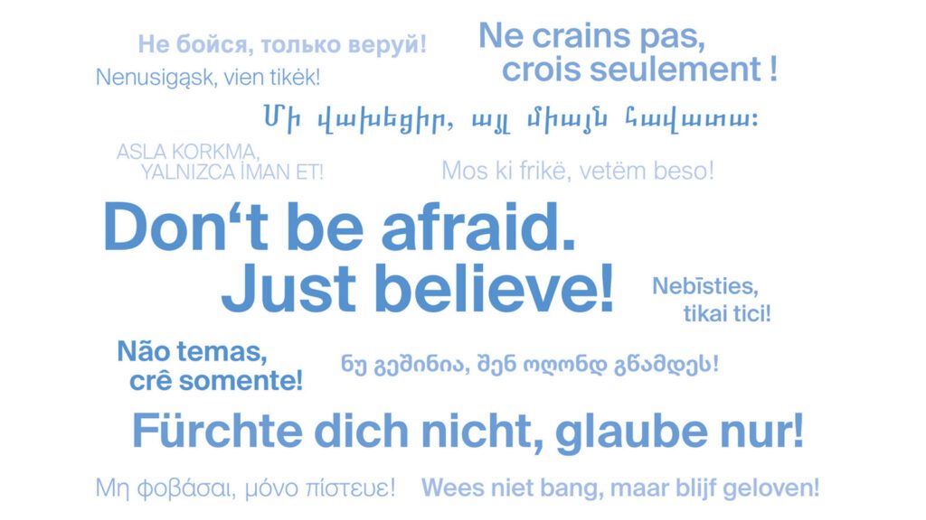
“Don’t be afraid. Just believe!” in numerous languages. The European District Apostle Areas have once again visualised the motto as a word cloud.