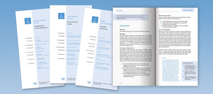
Brighter, more modern, with a better overview—this is how the latest edition of the Divine Service Guide presents itself. The most frequently translated publication of the New Apostolic Church is undergoing a relaunch. And this applies to more than just its design.
And so begins the new church year: anyone who has picked up the 12/2020 edition of the ministers’ booklet known as the “Divine Service Guide”—or opened it on a computer—will be struck by the new layout right from the title page.
An area shaded in blue provides clear allocations: calendar dates on the left, themes on the right. The earlier design also made use of a double column, but hopped back and forth between Sunday and midweek divine services.
Colour provides a better overview
The first thing that stands out on the inside pages is that the text is no longer set up in two columns, but rather only one. This gives the print a calmer feel. And above all, the Divine Service Guide can now be read more easily on smartphones or tablets, without having to constantly scroll.
The various information levels are clearly structured: the date, Bible text, and Summary are highlighted in blue. The main text appears in black and white. And background material such as the biblical Context is set in blue font.
Structure improves comprehensibility
Apostle Jürgen Loy, chairman of the Church’s Divine Service Guide Work Group, explains what is not immediately obvious: the subheadings are intended to reflect the structure of the train of thought even more clearly than before.
Bullet points are to appear less frequently in the main text than was previously the case. The reason for this is that more complex concepts cannot always be described—not to mention, translated—in the context of such lists than in fully formulated sentences that build upon one another.
Three designs were just the beginning
The preliminary considerations for the relaunch already began in 2018, explains Apostle Loy. At that time, the previous layout was already some twelve years old.
To kick off the hot phase, the graphic design department at Bischoff Publishers presented three different design options. Together with Chief Apostle Jean-Luc Schneider, the work group chose the variant that has now been implemented after several rounds of optimisation.
Variants do not simply inherit the look
The new design applies first and foremost to the coloured, narrow version of the Divine Service Guide (DSG) and the Special Editions, which mostly deal with doctrinal content. The paper format, however, has been retained for one very practical reason: it simply fits perfectly into the inside pocket of a suit jacket.
The somewhat bulky black and white version in A5 format is also being adapted to this layout. This format is an advantage in countries where it is impossible to print in colour and trim the paper as required, or where these operations cannot be financed.
It will still take some time before the new design makes its way into the DSG Yearbook. This is because the collected volumes of the periodical are published with a two-year offset to the monthly issue. The Yearbooks are used in countries where the local infrastructure makes it difficult to ship monthly publications to all the congregations.
Insights into the publication’s creation
The Divine Service Guide is a monthly periodical published by the New Apostolic Church International, which ministers use to help them prepare for sermons. It is sent to nearly 200,000 recipients around the world and is translated into more than 70 languages.
In two lectures at the International Youth Convention 2019, Apostle Loy and his work group colleague Apostle Jens Lindemann explained how the Divine Service Guide comes into being and how it can be used to create a sermon. The content of these presentations is currently being published on nac.today as a four-part video series.


