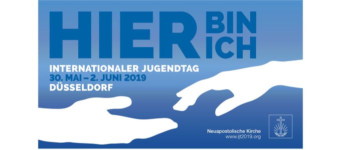
Two hands for the International Youth Convention

Two of his submissions have been chosen now: Ralf Heller designed the key visual for the International Youth Convention 2019 as well as the logo of the European Youth Day 2009. In the following interview he explains his ideas, as well as the difference between a logo and a key visual.
Ralf, the motto of the IYC is “Here I am”. You designed a key visual for this motto. What is a key visual anyway?
Ralf Heller: To translate the term literally, a key visual is basically a key image. Normally these are used in advertising campaigns. If you want to advertise an event, an item, a product, or a brand in a campaign using various campaign elements, you try to come up with a key image. The key visual supports a core statement, a brand, or a product. And this key image pops up everywhere in all advertising media and communication channels that you use.
Why does the International Youth Convention need a key visual?
Nowadays we are all overwhelmed with communication in the form of advertising. Just like a logo, a key visual serves to help us easily recognise company X, product Y, or institution Z. This is also indispensable for a big event such as the International Youth Convention.
People are usually familiar with logos. What is the distinction between a logo and a key visual?
Brands and businesses, including the New Apostolic Church, for example, make use of logos. A logo supports your brand or image pictorially. Products themselves merely have product names, not actual logos. The key visual supports content that is to be communicated in an advertising campaign, which is usually limited in time. The special thing is that a key visual makes it possible to emotionally charge a campaign.
You won the vote for the logo in the European Youth Day 2009. Why are we using a key visual this time around, as opposed to a logo?
The objective at the time was to develop a logo for the European Youth Day. There was no call for a logo this time around as a result of an insight gained from the previous event. The logo of the European Youth Day was used in concert with the Church logo. But if you create a logo incorporating a cross for the European Youth Day, it will always be competing with the logo of the New Apostolic Church, which also contains a cross in the emblem.
So two crosses. Hence a key visual?
Yes. If the NAC logo and a new logo always appear together, then the two of them will have to harmonise. This only worked under certain conditions with the logo of the European Youth Day. It makes more sense to create a key visual this time, and also describe it as such right in the work mandate.
Was this task different for you in comparison to the European Youth Day, or were there some commonalities?
I found it to be very different. When the objective is to develop a key visual, you have other elements that also need to be considered: a motto, the emblem of the NAC, or additional information. These things are variable. You have to let them play out on a poster in either portrait or landscape format. A logo is only one component of the overall communication strategy.
Let’s come back to the motto—“Here I am”. What was the first thing that popped into your mind when you thought about the motto?
The fact that it isn’t easy to find a striking key visual for the very general motto “Here I am”! This only works once you are clear about the various levels of meaning of the moto. It begins with the point of emphasis. Then it becomes exciting to think about, look into, and read up on where the motto comes from and all the things it might incorporate. Who is saying this to whom, and why? The first thing I thought of was a person in need of help. And then you immediately think of friends who come along and say, “Here I am.”
When the logo was selected for the European Youth Day, yours turned out to be the favourite. Did this put you under pressure this time around?
No, actually not at all. I didn’t see any connection there because it had already been such a long time. I had no greater expectations of myself than I usually do in my work. When I read the motto “Here I am” and the work mandate to develop a key visual for it, I was immediately struck by an idea.
How did you approach the task?
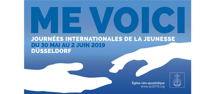
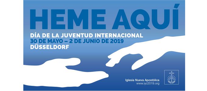
“Here I am”—to my mind it is certainly God who is speaking. But it is just as much the believer. For me there are two ways to transpose this into an image, either with a figure or a gesture. Then I asked myself how I might depict the motto in pantomime—and I thought of a pair of hands. I tried many different things with this motif: the hands had to be held in such a manner that they still said “Here I am”. They still had to be friendly hands, not as though one were giving the other money. I also tried out hands from above and from beneath, but this had the look of festival or as if someone was sowing seed from above. In the end I decided that the two hands should come in from the sides and nearly touch one another. This motif works as much for posters and printed T-shirts as for mugs or other objects. This finally convinced me, and that was the design I submitted.
According to the specifications, both blue and orange would have been permitted. Why did you choose to stick with the blue only?
I was quick to decide not to combine blue and orange, as was the case with the European Youth Day. For this reason, I came up with two sets of first drafts—one set in a blue colour scheme and the other in an orange one—just for the simple purpose of determining whether either one would even work. It can happen that you create the layout of a poster in blue, and either it doesn’t look good in orange or it has another effect in orange—and thus sends another message. For example, blue is one of the most popular colours around the world. Orange is a signal colour. It is not for nothing that safety vests are orange or that garbage collection services use orange.
What other thoughts did you have on the matter?
One was to make it more rational and formal. I needed a symbol that stood for a definition of position or site description, in the sense of “Here I am”. Then I thought of using the Google pin, which you can find in all navigation maps, as a framework. Both designs looked very good, but one was more rational and the other was simply more emotionally charged.
On what design did you settle?
I would have gone with both, but I had the feeling that the pin didn’t really go with church. The pin primarily reflects position, but it is missing the reference to God or the believer. The design is thus too one-dimensional. The hands clearly have more levels of meaning and also make more of an emotional impact. In that regard, I am also happy that the decision was made in favour of the hands.
You were one of the first to see the motto, and you have studied it intensively. As a young person, what are you expecting of it now?
As a young person I would expect the motto to actually apply. At the Youth Convention I would like to be able to feel that God is telling me: “Here I am.”
The key visual for the International Youth Convention 2019 is available for download at www.ijt.2019.org in English, French, German, Portuguese, and Spanish.


