Cultural wealth in a logo
One faith, one doctrine, and a big cultural diversity. “Faithful to Christ” is the 2018 motto of the New Apostolic Church. Creative minds around the world have designed logos to reflect the new motto.
-

Photo: NAC Canada
-
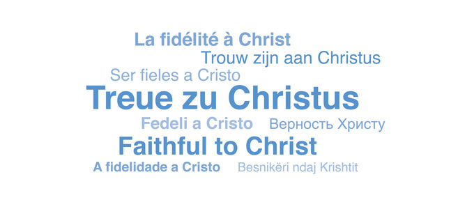
Photo: NAK Westddeutschland
-

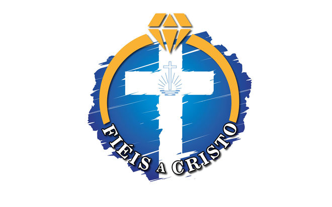
Photo: INA Brasil
-

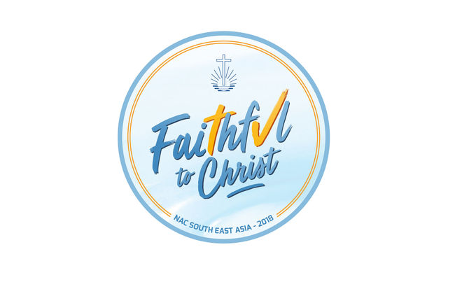
Photo: NAC SoutheastAsia
-

Photo: NAC Southern Africa
-
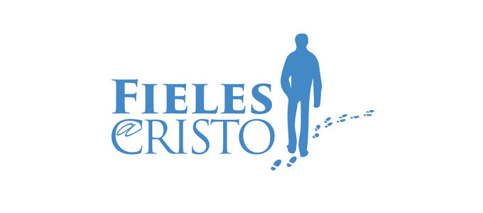
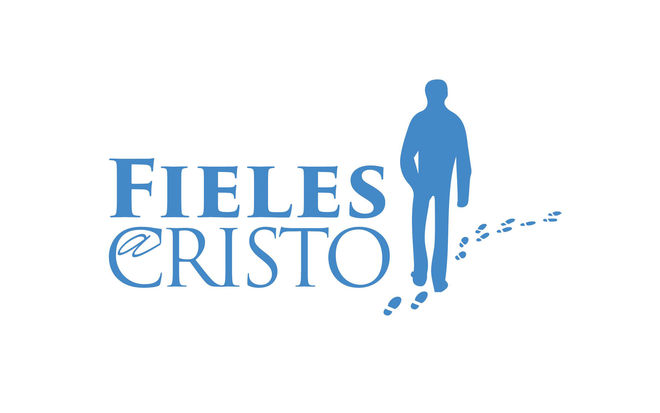
Photo: INA America Sud
-
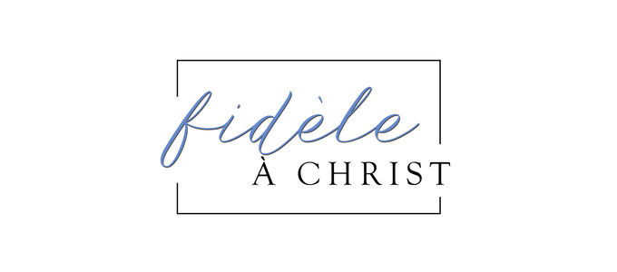
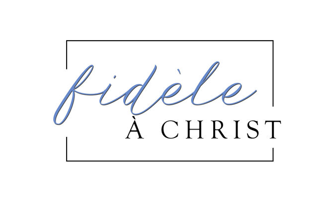
Photo: NAC Canada
-

Photo: NAC India
-

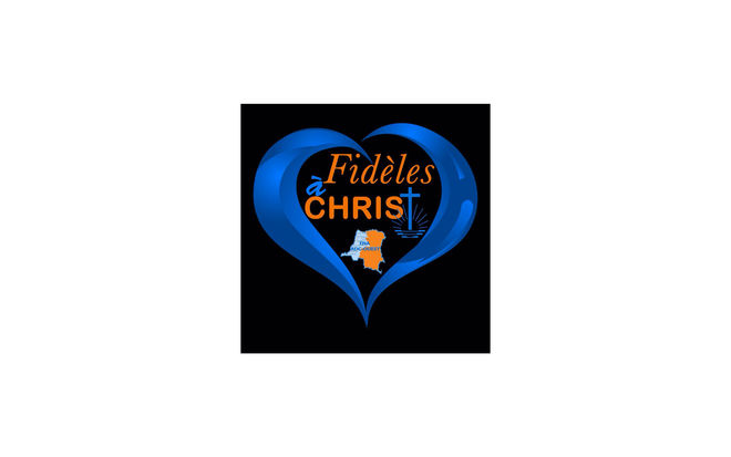
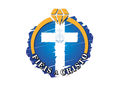
Photo: ENA DRC Quest


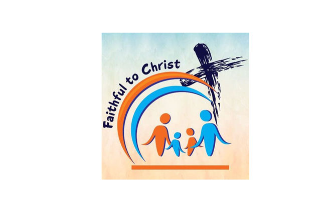


At the start of a new year, there is a great deal of excitement in the New Apostolic congregations in South-East Asia. In the first divine service the brothers and sisters do not only hear about the new motto which the Chief Apostle issued to all the congregations worldwide, some congregations also watch his taped video message together after the service. In addition, the church goers receive a promotional button with the new motto, which they can wear every day.
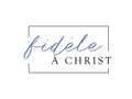
Constancy and commitment
An expressive brush font in dark blue on a light blue background with orange accents. The “t” in “faithful” takes the form of a cross and symbolises Christ. The “u” has been designed as a kind of check mark to symbolise trust and acceptance with regard to our faith in Christ. “The circular logo symbolises our never-ending commitment to Jesus Christ,” Priest Keefe Setiobudi explains.
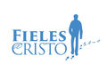
In the footsteps of Jesus
The New Apostolic Church South America has illustrated the 2018 motto “Faithful in Christ” with the silhouette of a person following a set of footprints. After all, the idea is to follow the way paved by Jesus, our correspondent Viviana Aloy says, and cites examples such as being constant in love, serving Him faithfully, and keeping our promises.
An indissoluble bond
Constancy and commitment are also reflected in the logo of the District Church Brazil/Bolivia. A white cross on a dark blue background symbolises Jesus Christ. And both are securely held in place in an orange diamond ring—as a symbol for an indissoluble bond. This is how our nac.today correspondent Karin Zwar explains it.
A partner for the Church emblem
The New Apostolic Church Canada uses a pared-down design to illustrate the annual motto: slim lettering in a subtle shade of blue, and subtly framed. There are good reasons for this design, nac.today correspondent Christy Eckhardt says. This way, the logo for the annual motto does not compete with the Church emblem. Instead, the emblem and the annual logo complement each other through the use of standard design colours, and both work equally well in the design of letterheads, as email signatures, as well as in flyers and other promotional media.
A covenant under the sign of the cross
The New Apostolic Church Southern Africa has put its focus on the fellowship of the faithful with blue and orange elements in the form of abstract people, in this case, a family. Above them are two curved lines that look a little like a rainbow—the Old Testament sign symbolising a covenant—which is crowned with the symbol of the cross and stands for the new covenant with Christ.
Diversity: tradition and programme
The New Apostolic Church Western Germany has decided to concentrate on the international character of the Church with the design of its logo. “Faithful in Christ” is repeated in nine different languages for the countries they look after. The New Apostolic Church India works with different colours every year. Their design focuses on the year—not least of all because the logo is used in their annual wall calendar.
Such diversity has become a tradition in our Church. Since Chief Apostle Jean-Luc Schneider issued his first motto in the year 2014 (“Labour in love”) the District Churches have done their best to come up with evocative ideas: on the Internet and letterheads, in magazines, or in calendars. And creativity is contagious: different designs from various congregations are coursing through the social networks—nothing official, but with a great deal of heart for the cause.
“We are an international Church and live in many different cultural areas,” Peter Johanning, the spokesman of the Church says. He welcomes the idea that the central message issued by the Church is regionally adapted as a logo and shared. There is one exception, however: the official Church emblem may not be modified. “This is our official internationally recognised emblem; it must remain identifiable as such,” Peter Johanning stresses. “Otherwise,” he says, “we can gladly show that we are a living and diverse community.”