Logo 2022: Cultures nail their colours to the mast
The 2022 motto is doing its rounds. Circles and rings seem to be the most popular motif for this year’s motto “Together in Christ”. Here is a look at the various logos developed by the District Apostle Areas around the world.
Only one letter distinguishes the two language variants of the New Apostolic Church South America. Because juntos and Christo are used the same way in Spanish and Portuguese, the languages spoken, for example, in Argentina and Brazil respectively. The two O’s join to form two interlaced rings. “The interlocking rings symbolise the union with the triune God, as well as the trust and confidence we place in Him, by staying at His side,” explains the graphic designer.
The logo of the New Apostolic Church Canada consists of three differently coloured interlaced rings created with a brush stroke effect. Here too, the reference to the Trinity is immediately recognisable.
The New Apostolic Church DR Congo-West created its logo in the form of a circle with four stylised people. They represent the four elements of the first church: the teaching of the Apostles, fellowship, breaking of bread, and prayer. They are meant to show that all four are necessary to attain perfection in Christ. The various shades of blue represent the diversity within the community. In the middle of the date, 2022, the designer has created a red heart to represent love. “As a circle and together in Christ we can return to eternal fellowship with God,” is the explanation.
The logo of the neighbouring Regional Church, DR Congo South-East, is quite similar in form and colour. Five stylised people in various shades of blue surround a dynamic cross. The logo represents the star of unity, so the explanation from the Church office, but also a perfect circle to represent the equality of all human beings before God. And the sign of Christ in the middle represents the thought: “Our common bond is the One who means everything to us.”
Three individuals holding hands and thereby forming a circle: these are the symbols in the logo designed by the New Apostolic Church Sambia, Malawi, Simbabwe. The three individuals represent the triune God, but also the dependency on each other in the “family” that makes up the New Apostolic Church. “The various colours relate to the cultural diversity. Despite these differences, there is fellowship and support, and a praying and working together toward the goal of our faith.”
The design for this year’s logo for the New Apostolic Church Western Pacific fell to the members in Samoa. There is a whole story to this design. The small oblong shapes on the top and bottom represent grave stones and thus the dead, and the four shapes of people holding hands represent the living. Both the living and the dead are together in Christ. The three crosses represent the Trinity. The four green triangular shapes signify the hills from where our help comes, with reference to Psalm 121. The long orange spear shapes between the circles represent the long boats that are found in the Pacific Islands. To move forward effectively, the people in these boats row in absolute unison. The spears also symbolise courage and fighting the good fight.
The New Apostolic Church Southern Africa addresses all four aspects of the New Year's message. Fellowship with the triune God is represented by the three T’s shown as orange crosses. Fellowship in the divine service is represented by the blue outline shaped as a house or church. The four figures represent living together in fellowship. They are all different in colour and size to represent the myriad cultures in South Africa. The lighter shades of colour symbolise the dead and the darker shades the living. And, finally, the small “i” in Christ represents the individual: as individuals we all together make up the fellowship in Christ.
Christ as a unifying element: this is the idea of the logo of the New Apostolic Church South East Asia. The logo consists of two fingerprints depicting the uniqueness of each individual. This individuality is united by the blood of Christ—symbolised by a drop of blood—and forms a heart-shaped pattern to represent love. The colours blue and orange were chosen as the widely recognised brand colours of the New Apostolic Church. The purple colour in the drop of blood was chosen to depict the majesty of the blood of Christ.
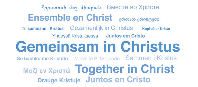
While the logograms of the other Regional Churches exist in two language variants at best, the design chosen by the New Apostolic Church Western Germany has lots to offer in terms of internationality. The word cloud visualising the motto comprises a total of 17 languages. Here, too, one can see the reconciled diversity of cultures.
Article info
Author:
Date:
Keywords:
Andreas Rother
17.01.2022
Media,
International,
Congregational life,
motto,
Together in Christ


