Annual motto gives wings to creativity
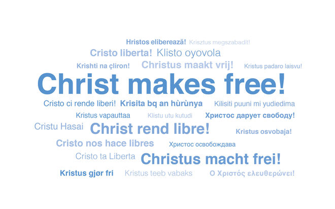
A single thought brought to life in many cultures—the diversity of logo ideas for the 2020 annual motto “Christ makes free” is as colourful as life itself. What stands out this time: many of the designers have given the motto graphic wings.
-
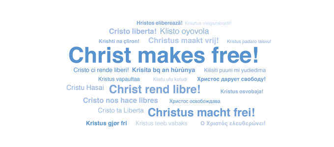
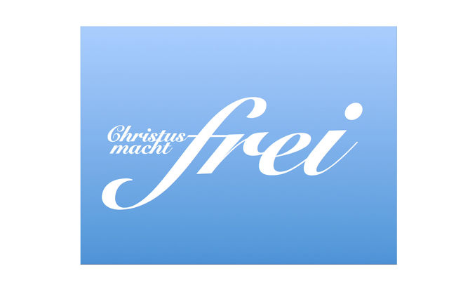
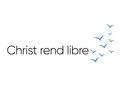
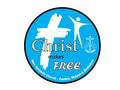
Photo: NAK Westdeutschland
-
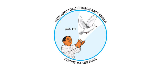
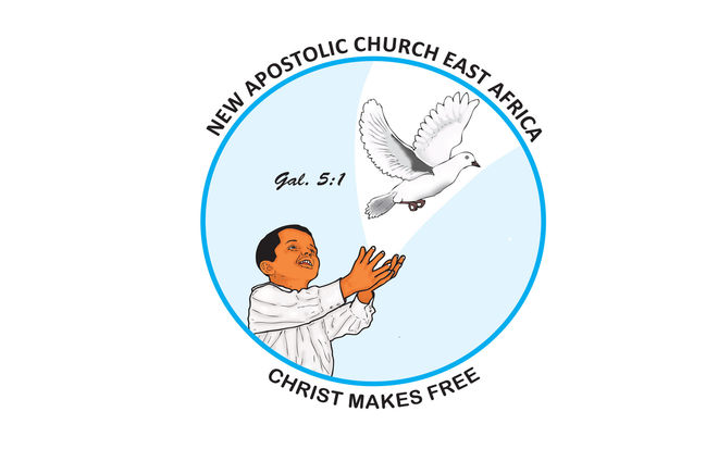
Photo: NAC Eastafrica
-
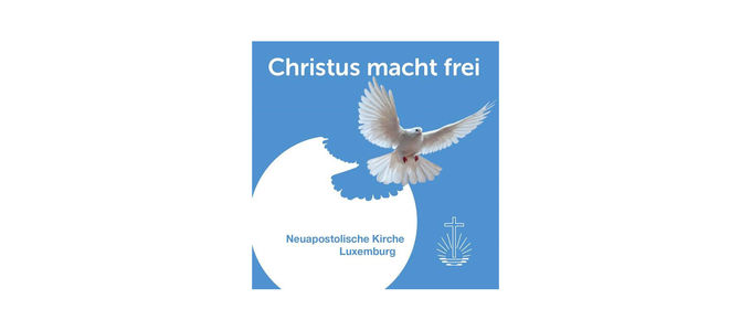
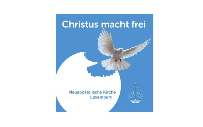
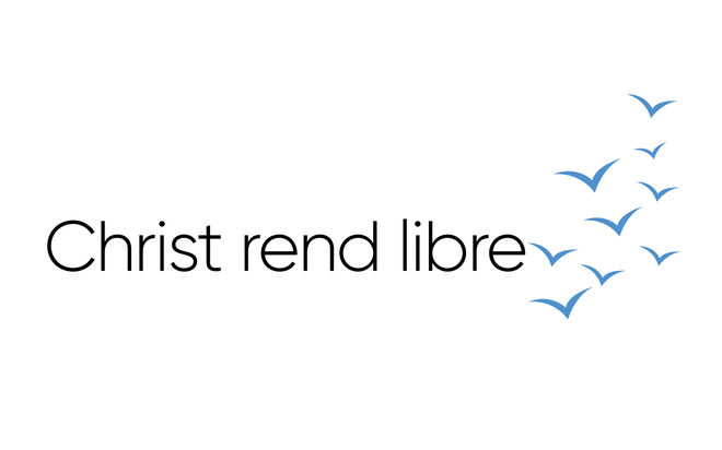
Photo: NAK Luxemburg
-
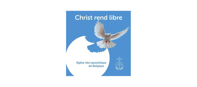
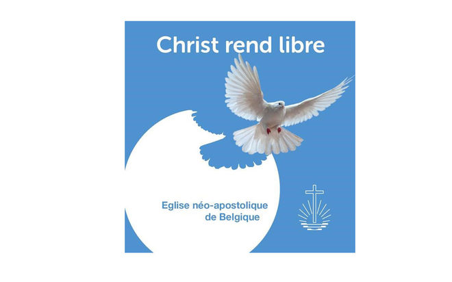
Photo: ENA Belgique
-
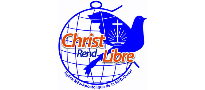
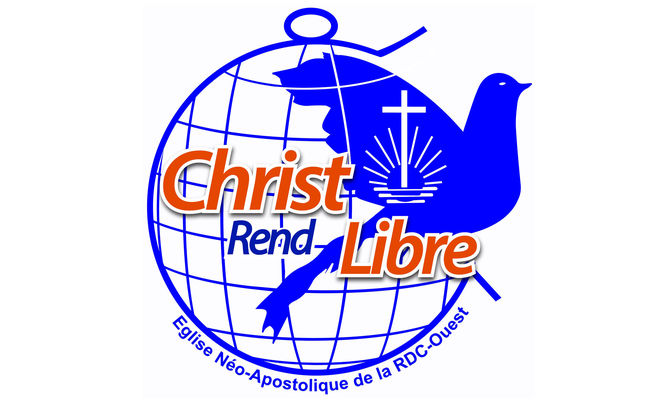
Photo: ENA RD Congo Ouest
-
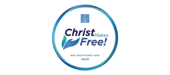
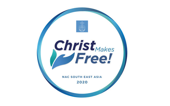
Photo: NAC South East Asia
-
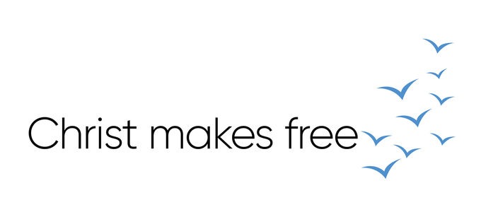
Photo: NAC Canada
-
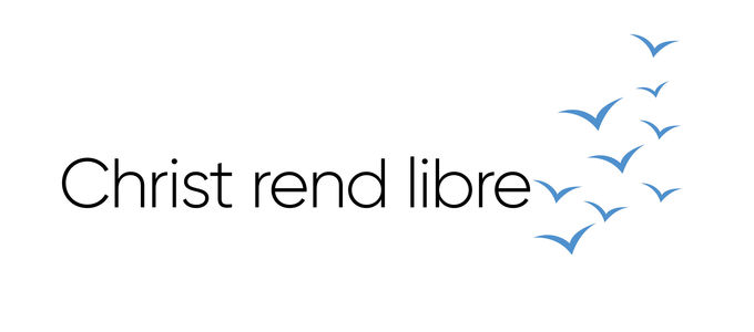
Photo: NAC Kanada
-
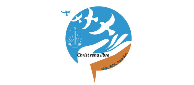
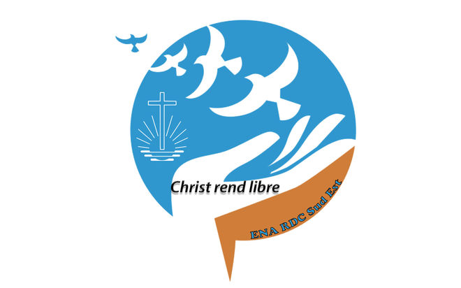
Photo: ENA DR Congo Sud Est
-
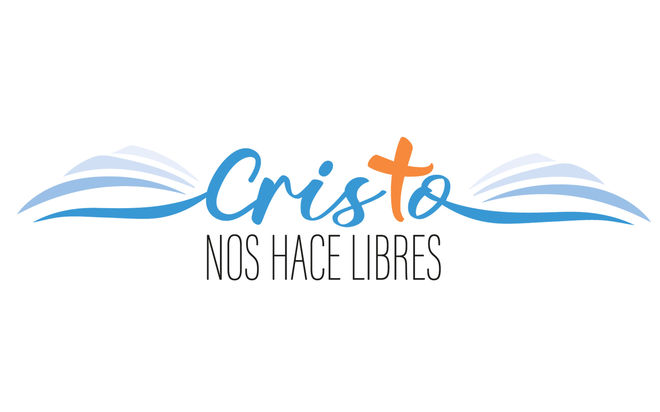
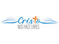
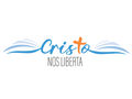
Photo: INA Sudamérica
-
Photo: INA Sudamérica
-
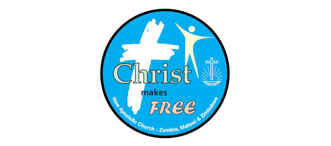
Photo: NAC Zambia
-
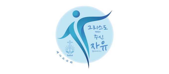
Photo: NAC South East Asia
-
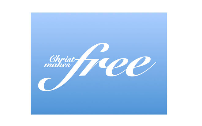
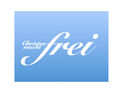
Photo: NAK Nord- und Ostdeutschland
-

Photo: NAK Nord- und Ostdeutschland
-
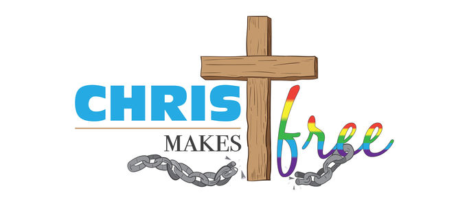
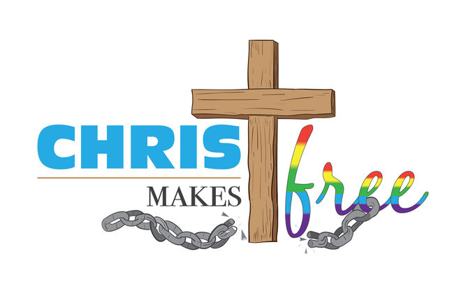
Photo: NAC Southern Africa


Hardly had the New Year been rung in when all sorts of logo designs began popping up in the social networks: some of these were the work of enthusiastic Church members, but a select few constituted the official symbol of their District Church, many of which are represented here.
From a dove…
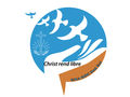
Even before the start of the New Year, there was plenty of diversity in the Democratic Republic of Congo West. The District Church had an abundance of choices right from the start. This was because there were already many suggestions from the ranks of the members. The Apostles and Bishops finally decided on a design that depicts the earth as a prison from which a dove is escaping.
A stylised version of the exact same bird takes flight toward heavenly freedom in the logo from South East Asia. The cursive writing symbolises the movement of the believers in this direction. The border of this logo plays with tones of blue and takes the shape of a circle because the motto was also distributed to all in attendance at the opening service for the year in the form of a button.
… to a flock of birds
Canada, on the other hand, shows a whole flock of birds winging its way heavenward. This represents a development leading out of bondage and into freedom. The Logo follows the same open and discreet design of previous years, and is available in both English and French.
The design from the Democratic Republic of Congo Southeast has a very similar message: here a row of birds emerges from an opening hand and ultimately even makes its way through the round blue background.
Focus on the cross
With its focus on wings, South America offers a variation of the same “uplifting” theme: the base symbolises the protection and care of God. The open, airy design also represents freedom. And the blue shading of the wings describes the developments of the various phases of life. The orange-coloured cross is a reference to Christ and His church.
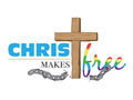
The cross—specifically, one that is rough in shape—is the focal point of the logo of the District Church of Zambia, Malawi, and Zimbabwe. This is intended to represent the suffering and death of Christ, whereby He liberated mankind from sin. Beside it stands a stylised man whose upright posture is an expression of freedom and joy.
Colourful diversity
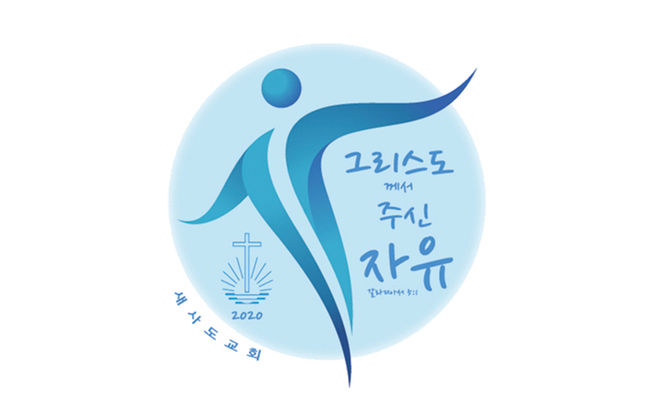
An upright man standing free also dominates the logo from Korea. His arms unfold almost like wings. Letting things stand free is also the objective in the purely typographical deletion in the logo from Northern and Eastern Germany. Here it is the word “free” itself that stands completely free.
The design from Southern Africa practically tells a story in pictures: the wooden cross as the symbol of Christ’s unconditional sacrifice breaks the chains of sin. The colourful “free” is a reference to the previous year’s motto and the cultural diversity of the District Church, which is a rainbow of nations.
And so we see depicted in vivid terms something that Chief Apostle Jean-Luc Schneider already expressed in an interview in mid-2018: “The New Apostolic faith can be practised within the most diverse of cultures!”