
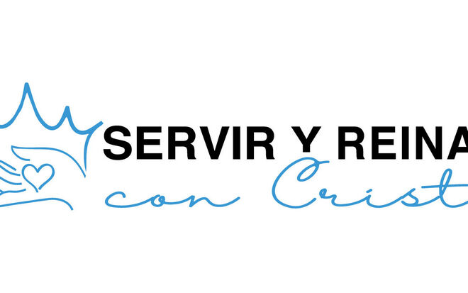
The crown is a popular motif used to design the 2023 logos. It allows the Regional Churches to illustrate the annual motto “Serving and Reigning with Christ”. But not all designers used a crown to emphasise the royal aspect of this year’s motto.
-

Photo: NAK Westdeutschland
-

Photo: NAC Canada
-

Photo: NAC Canada
-
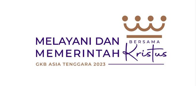
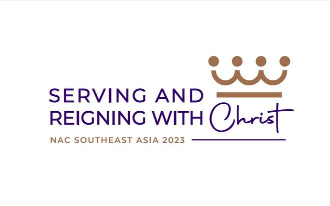
Photo: NAC South Eas Asia
-
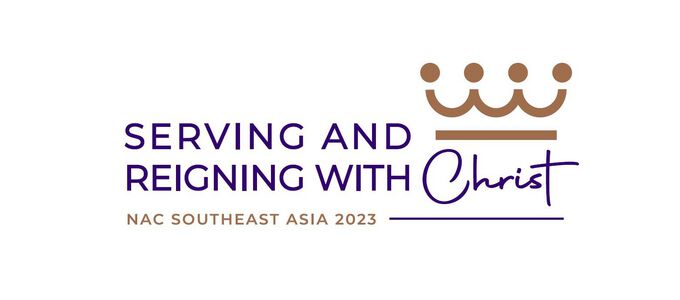
Photo: NAC South Eas Asia
-
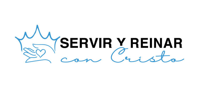
Photo: INA Sud América
-
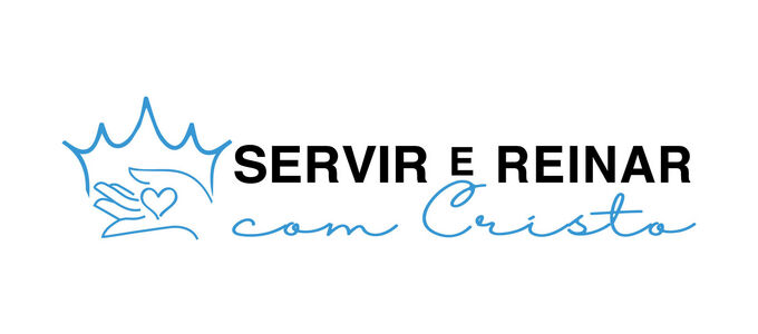
Photo: INA Sud América
-

Photo: NAC Southern Africa
-

Photo: NAC East Africa
-

Photo: NAC Western Pacific


Twenty-five languages used a word cloud to visually represent the motto. It was designed by the Church in Western Germany to make the annual motto as understandable as possible. The European District Churches collected the mottos in their respective languages, and had them placed into the logo. The New Apostolic Churches Northern and Eastern Germany and Switzerland joined in and contributed the motto in Estonian, Finnish, and Romanian, for example.
The striking element of the Canadian logo is the golden crown. The video published by the Regional Church shows a logo that is made up of stylised people. It shows everyday situations in which people serve others. The individual situations are united to form a crown. District Apostle Mark Woll explained the logo on 1 January: “The crown symbolises reigning and royalty. But this crown is made up of people. It might not be obvious, but now you can actually see that the crown is made up of people who come together in order to serve with their arms and hands together. And in the centre of this the crown is the cross, which means they serve Christ.”
When you first see the logo of the New Apostolic Church South East Asia you only notice the crown above the lettering, but if you take a closer look you will notice stylised people holding hands. They form a unit, who serve one another and praise God together. The designers also thought about the colour. The purple lettering represents royalty and nobility. The crown is made up of stylised people is gold. “The meaning of the colour gold is multifaceted, often denoting generosity and compassion, as well as being synonymous with divinity and power,” the designers write.
The logo of the New Apostolic Church South America comes along in our New Apostolic black and blue. The Communications team says the following about the crown and the hand holding a heart: “We serve the Lord because we love Him and when we do it in this way, we are giving Him our heart. On the other hand, He also allows us to help those who need help. The heart in the hand represents our offering, serving one another, serving our Father, and longing to reign with Him when the day of all days comes: the return of Christ!”
The designers of the logo for the New Apostolic Church Southern Africa put a lot of thought into the font style and size. The wording “Serving & Reigning” is styled to look regal and portrays a royal look. The words are also the same size because both words have the same importance and do not supersede each other. “We reign by serving,” the Communication team writes. The figures form the shape of a crown. “They represent the members in our area, and the different colours represent our diversity and rainbow of nations,” the Church in Southern Africa says. This theme was also featured in last year’s logo. The accentuated cross in the word “Christ” symbolises the ultimate sacrifice of Christ. “We celebrate His sacrifice in every divine service when we partake of Holy Communion.” And “the arc under the crown symbolises the light of Christ that guides us on our path of faith”.
Crosses, crowns, a stop-watch, and green trees… The logo of the New Apostolic Church East Africa is comprised of different details to represent both our serving and reigning today and in the thousand-year kingdom of peace. Today serving—namely sharing the benefits of Christ’s crucifixion with all of mankind—is more visible than reigning, which is why there is a big cross pointing to a smaller crown. In the thousand-year kingdom of peace this will be the other way around. The stop watch symbolises the length of time of the kingdom of peace, but which is limited in duration. And because everything will take place here on this earth, it is important that we preserve the environment—this is symbolised by the trees.
The logo designed by the New Apostolic Church Western Pacific does without a crown entirely, but the Japanese influence is immediately apparent. It is represented by the fan, a traditional cultural element in that country. The Japanese character for “king” is represented by the orange symbol on the right of the fan. The upper horizontal line represents heaven, the lower horizontal line represents earth, the middle horizontal line is mankind, and the vertical line governs all.
The New Apostolic Church DR Congo South-East decided on a perfect circle to represent the universe. The hands symbolise the members of the Regional Church to illustrate that they all serve. The floral wreath is the sign of the King. Christ is represented in the middle by the cross in the emblem.
The logo of the Regional Church DR Congo West is being held up by two hands. The reigning aspect is represented by the crown of gold. All of this is built upon the foundation avec Christ (with Christ).
What the annual logo will look like in India is not yet clear. The winner of the design competition has yet to be determined. The Regional Church regularly publishes updates on the competition on Facebook and Instagram.