The new logos are in: well-conceived and colourful
An Apostle who not only preaches about the new motto for the year, but also converts it into art for his District Church? It can happen—as it did, for example, in the District Apostle Area Western Pacific. But other graphic designers all around the world have also been at work to create new logos for the year.
-
Photo: NAC Canada
-
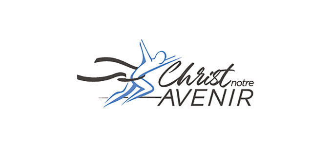
Photo: NAC Canada
-
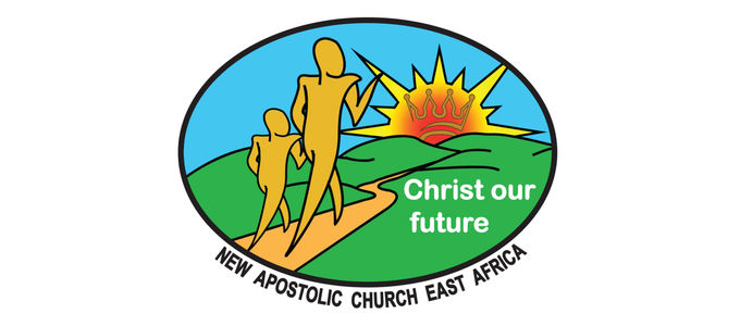
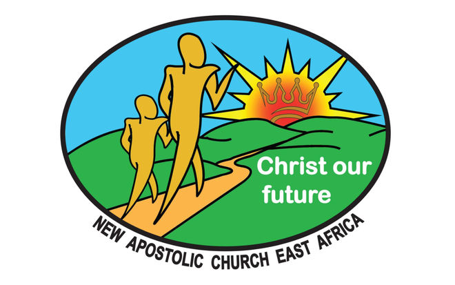
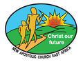
Photo: NAC East Africa
-
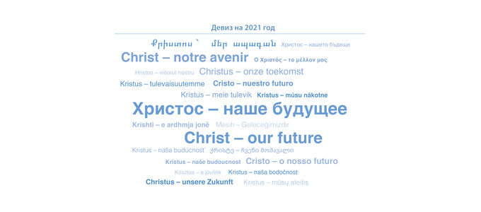
Photo: NAK Berlin-Brandenburg
-
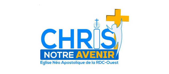
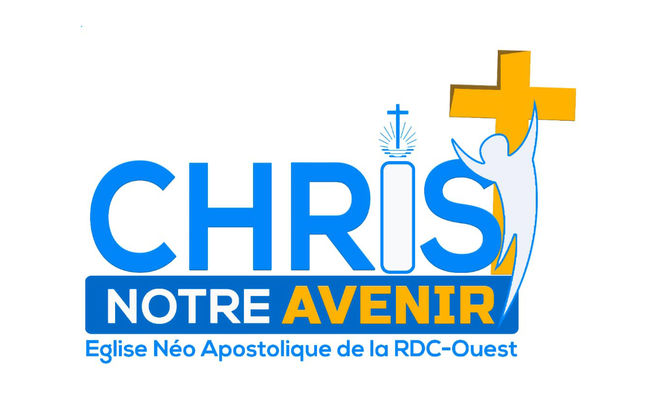
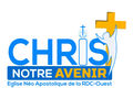
Photo: ENA DR Congo Quest
-
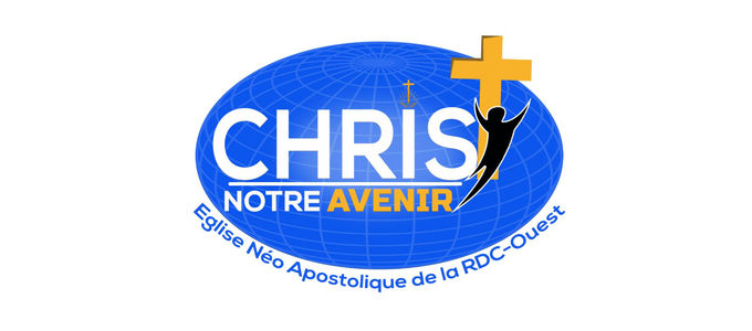
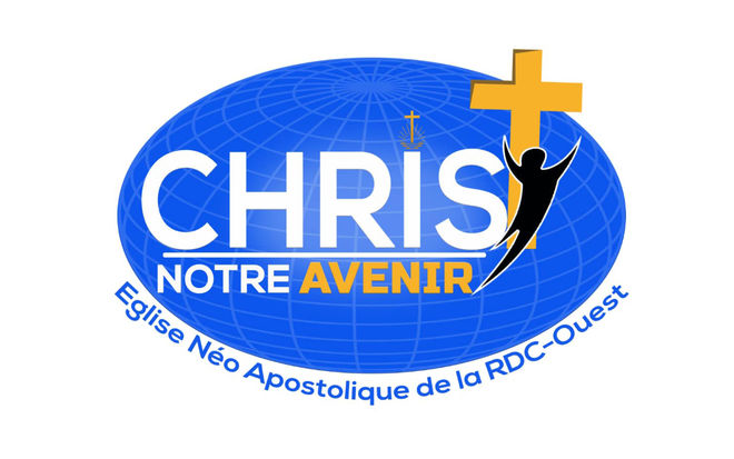
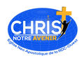
Photo: ENA DR Congo Quest
-
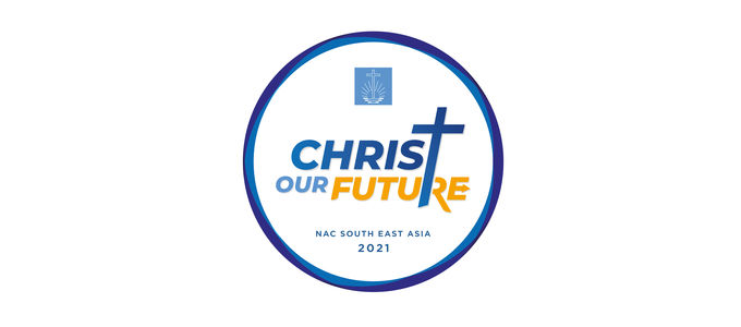
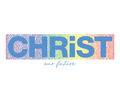
Photo: NAC South East Asia
-
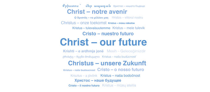
Photo: NAK Westdeutschland
-
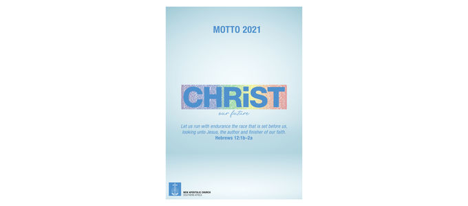
Photo: NAC Southern Africa
-

Photo: NAC Western Pacific
-

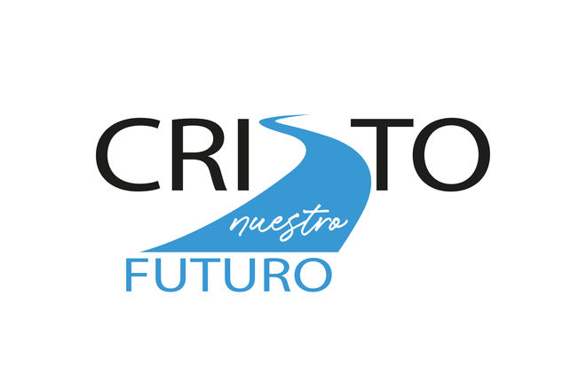
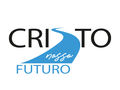
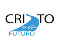
Photo: NAC Southern America
-
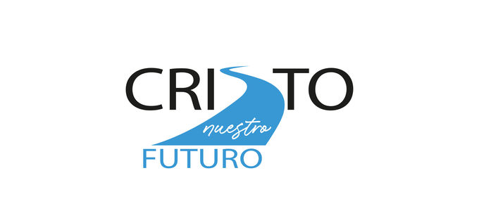
Photo: NAC Southern America
-
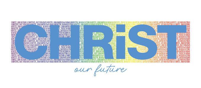
Photo: NAC Southern Africa
-
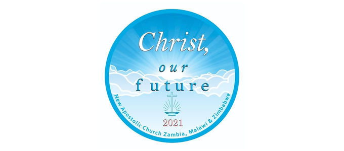
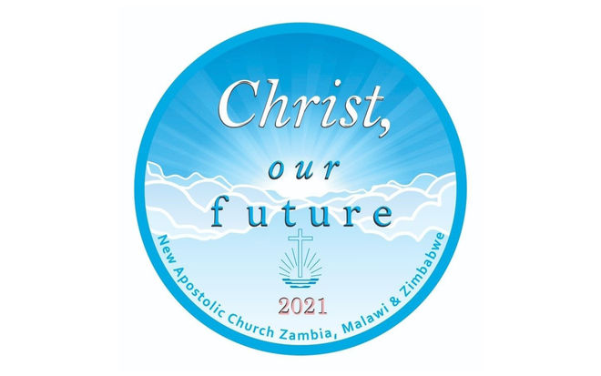
Photo: NAC Zambia


“Christ, our future” was the motto that Chief Apostle Jean-Luc Schneider introduced for the year 2021 in his New Year’s address. And this motto has been converted into art with great skill by our members around the globe. The editors of nac.today talked to our designers from around the world, and are happy to present the images and logos created by the various District Churches.
The designers: approaching their art with expertise and passion
Every now and again, Keefe, Jennifer, Brent, Céjor, Elvis—along with many others—go to work for their District Church as graphic designers. They have been engaging their talents with creativity and competence for a number of years now: they produce posters, brochures, and logos for special occasions, take on design tasks for the Church, and implement the requirements specified by the corporate design manual of the international Church.
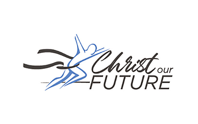
At the turn of each year, the artists are regularly confronted with a special task: it is their job to transform the Chief Apostle’s annual motto into a corresponding graphic image. This year there was even an Apostle who dared take on the task. Apostle Trevor Williams from the District Apostle Area Western Pacific sat down at his digital drawing board to illustrate the motto for the year.
The implementation: expressive and colourful
Priest Keefe Setiobudi from the District Church of South-East Asia explains the elements of his circular masterpiece: “The capital letters emphasise the clear message of the motto itself. The ‘T’ in ‘Christ’ symbolises the sign of the cross. And the little arrow pointing forward in the letter ‘E’ represents the idea of looking ahead.”
Christy Eckhardt from Canada presents the work of a local sister: “The logo created by our graphic designer is consistent with the colour and dimensions used in previous years.” And it will also be clear to anyone familiar with the divine service at the start of the year “why the logo incorporates the theme of an athlete crossing the finish line”. Incidentally, there are two variations of the Canadian logo: one features the motto in English, while the other features the same words in French.
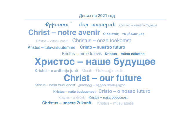
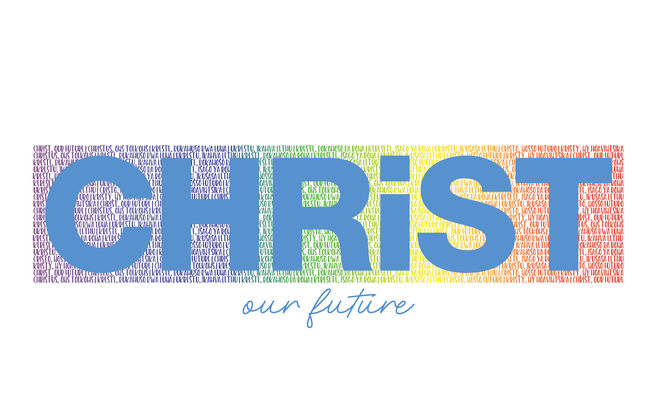
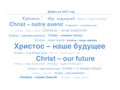
The European District Churches have developed a “motto cloud”. The annual motto comes together in about two dozen languages. The simple creation is familiar from previous years and serves to demonstrate the linguistic diversity in the European and Asian communities. The project not only involved the group’s graphic designer Jennifer, but a large number of translators as well.
The New Apostolic Church Southern Africa is also home to many different languages. Brent Thomas explains his design: “This year we have incorporated all the languages spoken in our District Church into our logo, namely English, Afrikaans, Lozi, Xhosa, Sesotho, Setswana, Zulu, Malagasy, and Portuguese.” This showcases the various cultural backgrounds. Brent goes on to add: “The small letter ‘i’ in the word ‘Christ’ is a symbol for all of us individuals who are nevertheless part of Christ. And the rainbow colours from our previous logos represent our District Church: a rainbow of nations—comprised of all the colours of the various national flags.”
The challenges: the journey from abstract to concrete
In South America it is likewise a sister who has brought her passion for detail to bear in her work. Viviana Aloy explains the creation of the graphic designer involved: “The future represents something that lies ahead of us like a path. Based on this idea, the logo incorporates the image of a pathway that directs attention toward the future. On the other hand, the image also has the function of articulating the letter ‘S’ in the name ‘Christ’ in order to achieve a unified concept.” All the elements of the logo are stylistically linked to one another.
The logo of the District Apostle Area Western Pacific likewise contains the elements of a path and a destination: “The logo was designed by Apostle Trevor Williams, and portrays our path into the future, with Christ as the dominant feature,” relates Carley Love from Brendale in Australia in response to an inquiry from nac.today.
The District Church of Congo-West is using no less than two logos. District Apostle Michael Deppner relates that it was simply too difficult to make a decision between two designs—and that both were ultimately kept. “One of them will be used for decorative applications and the other will be used on our letterhead. Both were proposed by our Deacon Céjor Botomwito from Kinshasa,” explained the District Apostle.
“The rays of the sun symbolise an assured and brighter future with Christ. The clouds represent the obstacles that must be overcome, and Christ in white stands for purity,” explains Deacon Nimon Muleya, nac.today correspondent from Zambia. The circular logo was created by Elvis Mumba Kachiza.
The applications: small, large, and gigantic
“Our District Apostle has asked us to create a printout of the logo to hang on the wall of every congregation,” relates Keefe Setiobudi and goes on to tell us about another special perk: “In the Philippines, every member will receive the logo in the form of a badge or button at the New Year’s divine service.”
In South Africa the logo will be used on NAC TV, the Church’s own television broadcaster, as well as “on posters advertising various events, on the annual calendar, on the website, on our letterhead, and in all congregational activities”, explains Brent Thomas with respect to the analogue and digital variants available.
“The logo will mainly be used on programme sheets for big events, as well as on T-shirts, banners, and billboards,” says Nimon Muleya from Zambia. “However, many of our members also use the logo in their social media accounts or as a background display.”
In South America the logo is used for just as diverse a range of purposes, as nac.today correspondent Viviana Aloy tells us: “On the one hand it is used in all the brochures of our Church, but it is also used for special events, souvenirs, and so on.” It is also used on various occasions as a leitmotif for many activities—just as in previous years—for example, as a theme in musical performances or in activities involving children or young people. “Our objective is clear, namely to use the visual communication of the theme in order to reinforce this year’s message from the Chief Apostle.”
Article info
Author:
Date:
Keywords:
Oliver Rütten
14.01.2021
Media,
International,
Congregational life,
motto